Békássy
Modernizing Heritage.
The Békássy family is producing wine on the southern slopes of the Badacsony since the 1840ies, therefore the main challenge was to transfer the family name into a strong brand that respects their long heritage of winemaking and expressing their dedication to quality, their respect for the grape and the soil it grows in, and highlighting the attributes of their wines: straight, bold and masculine.
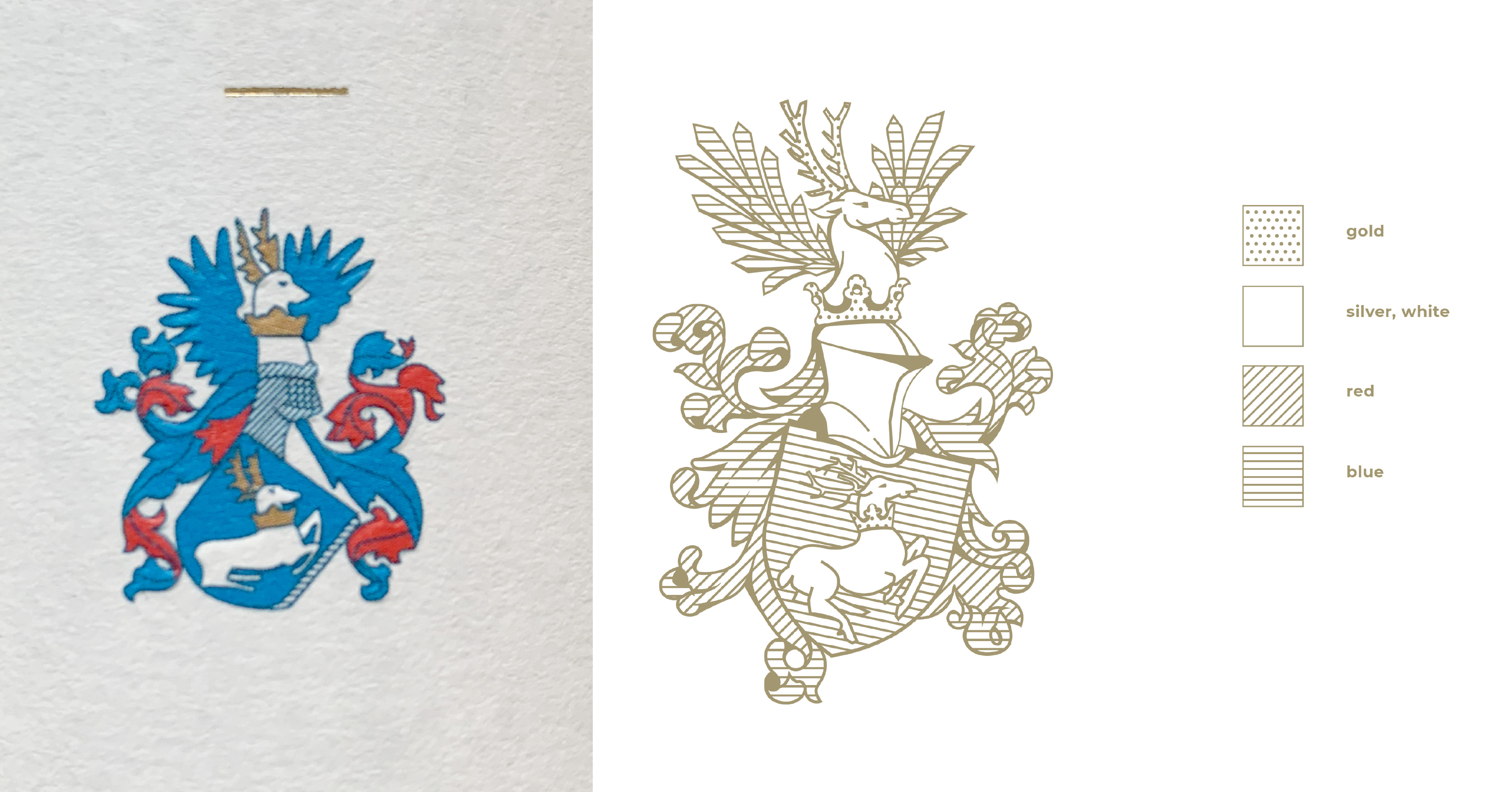
The only visual asset to work with is their coat of arms that was redesigned multiple times to the point where its elements became unfortunately deformed. I redesigned it completely from the ground up, based on various applications in family trees, heraldic catalogues, old china and silverware and strictly adhering to the graphic rules of heraldry.
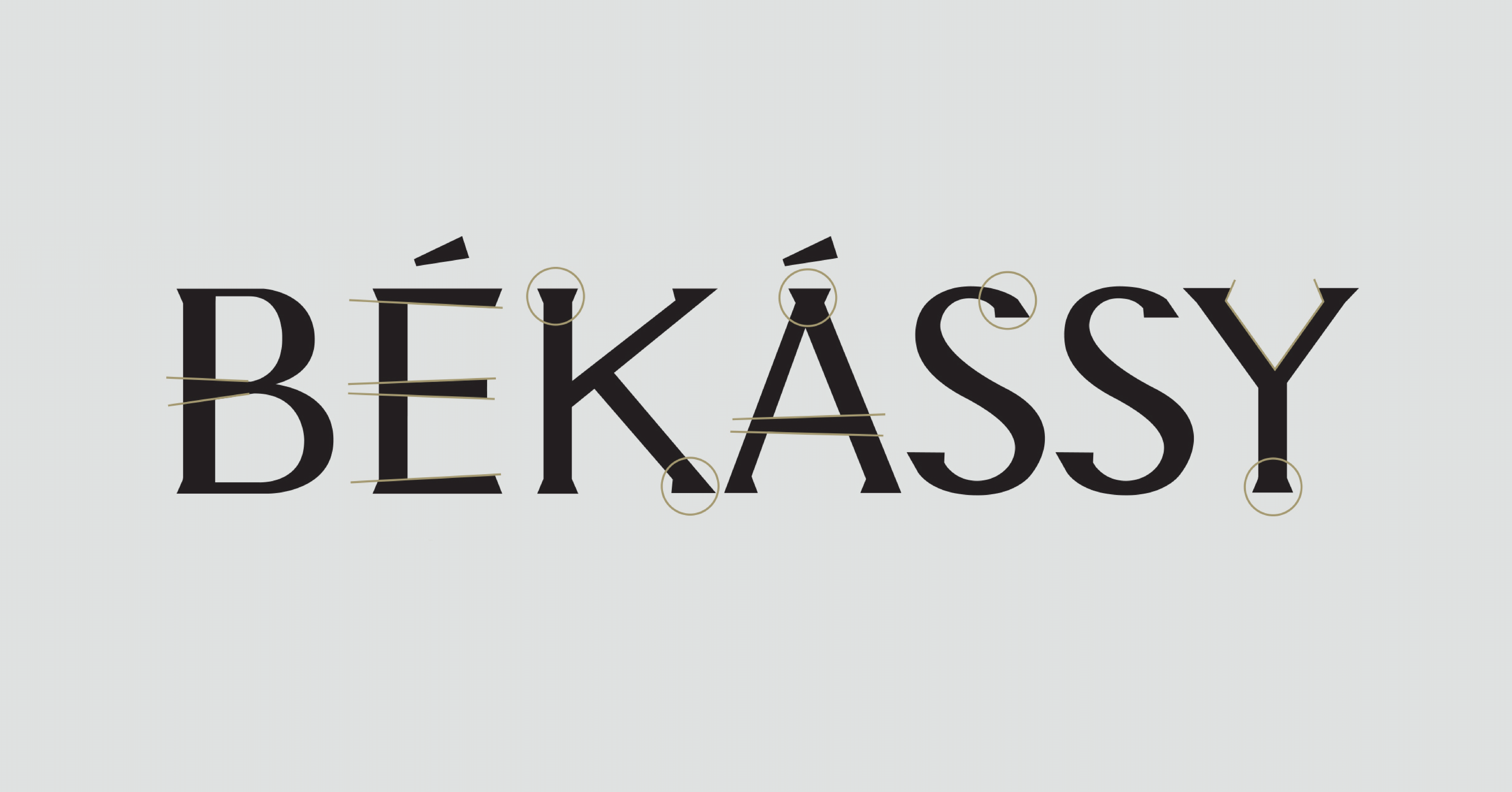
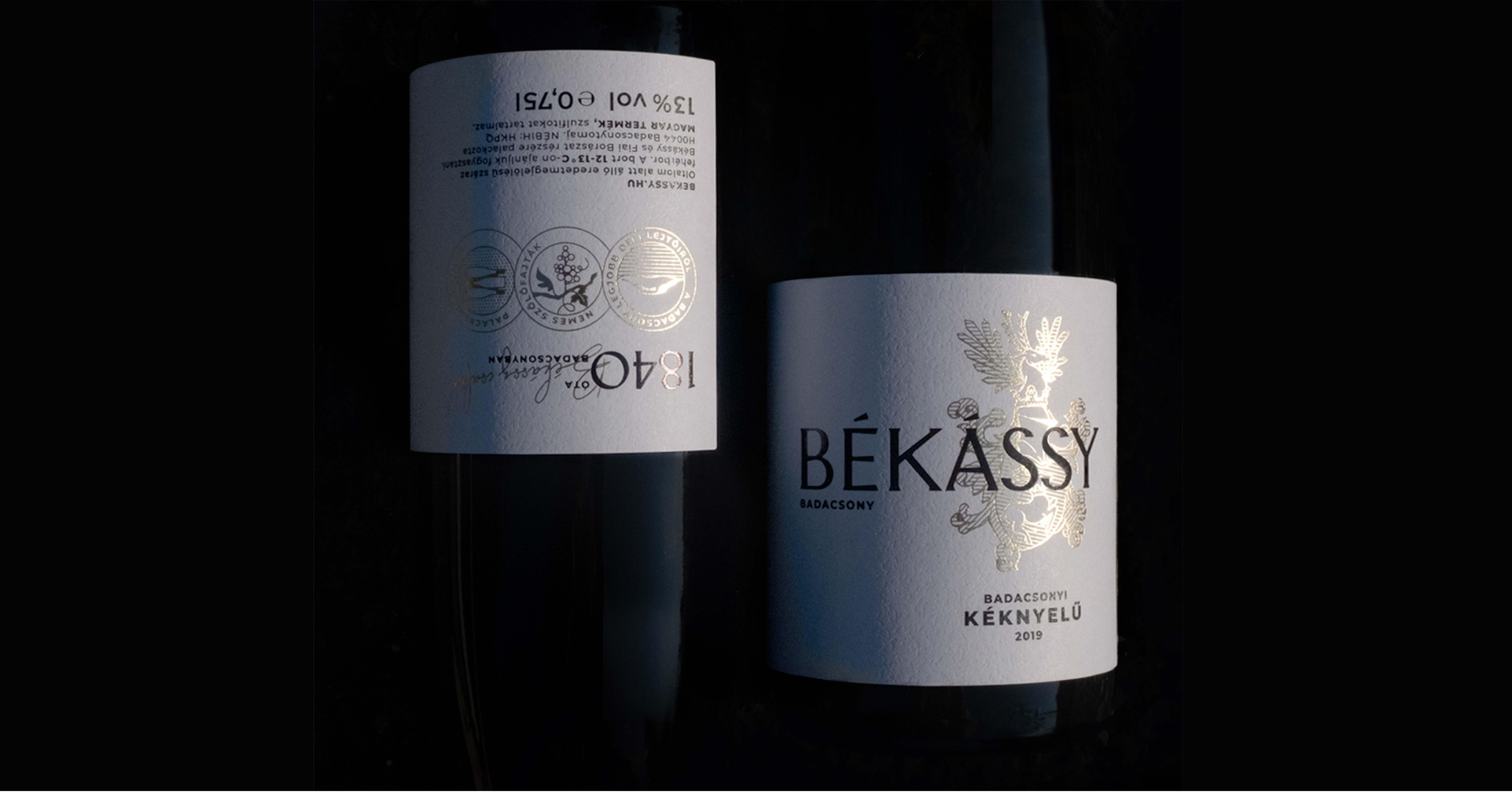
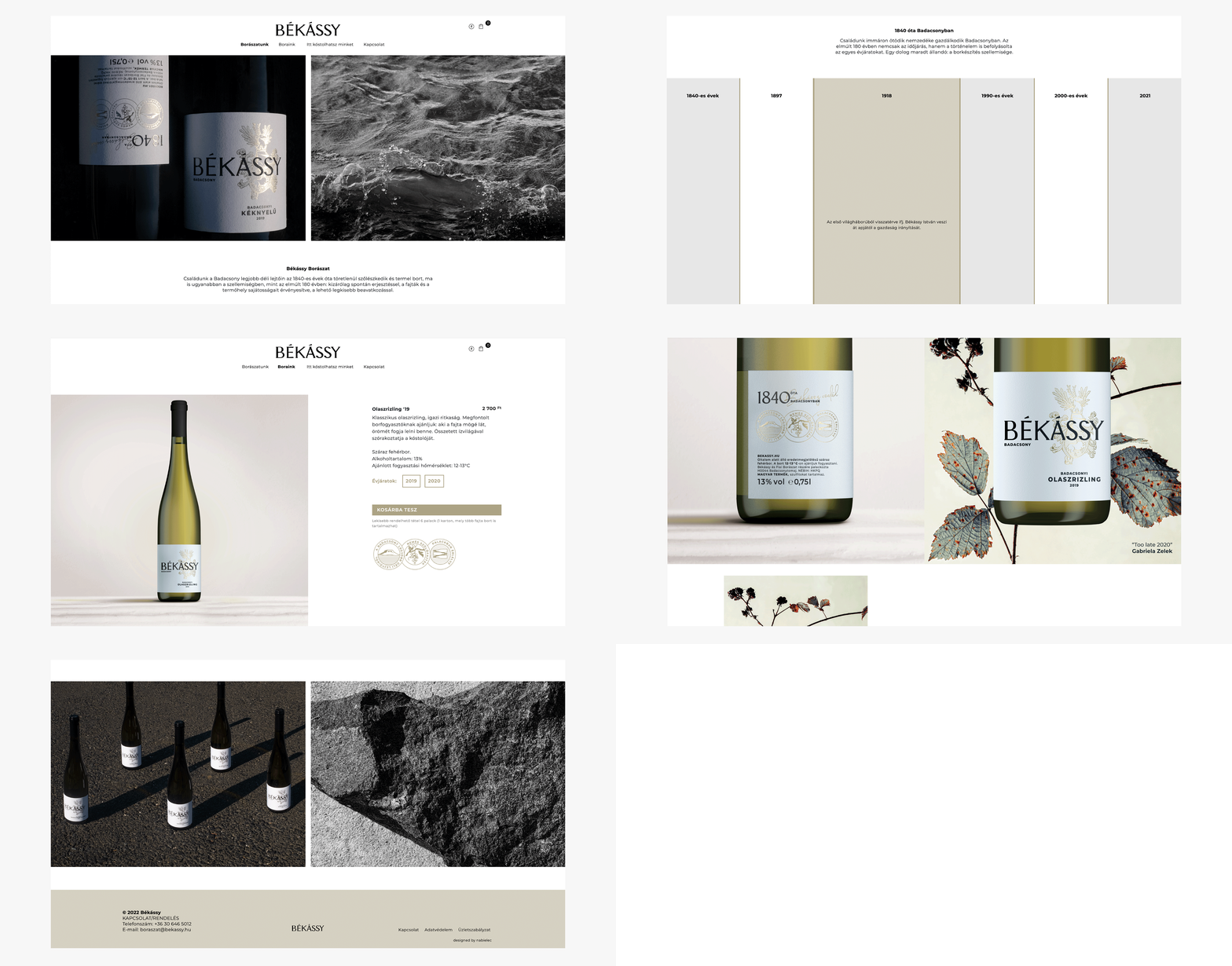
What makes the Bekassy family and their wine special is their dedication to quality, the respect of their family history and the straightness and honesty of their wines. I have tried to reflect all of this in their labels as well: a minimalistic design, with the front based only on the Békássy logo and the family coat of arms. The paper used for the label has a natural, textured feeling, providing a noble touch. The logo and coat of arms are printed with hot foil for the most impact and a high quality look. The back side of the label contains storytelling elements: the family signature, the year the winery was founded and 3 graphical icons, the first depicting the location of the vineyards, the second references the ancient Hungarian sorts of grapes they grow and the last icon highlights how the wine is kept maturing in the bottle, before it is available for purchase.
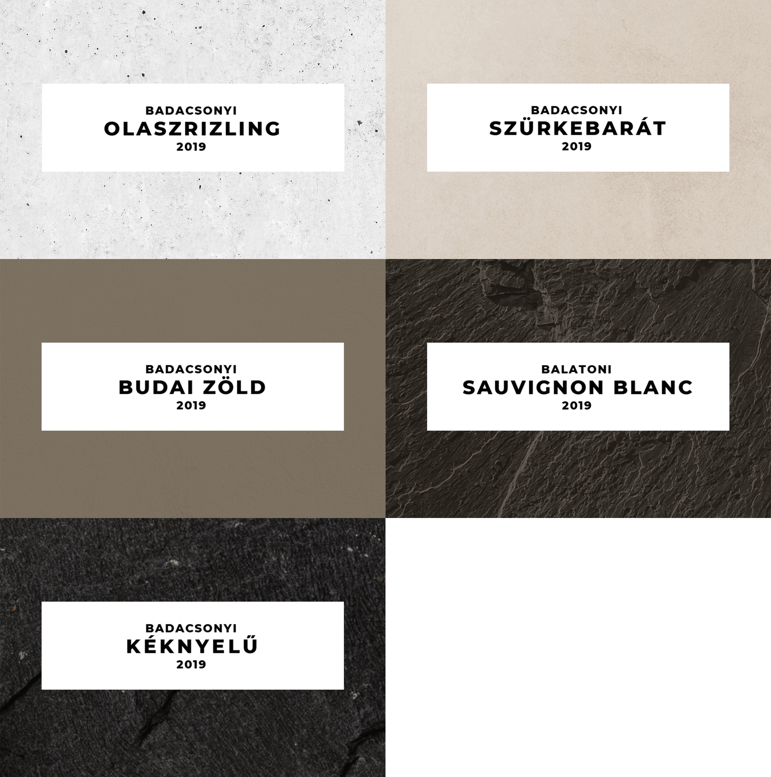
Based on the characteristics of the different wines I chose different stones to reflect those visually. These images are used in the webshop and in the product materials to create distinction between the different sorts and vintages.
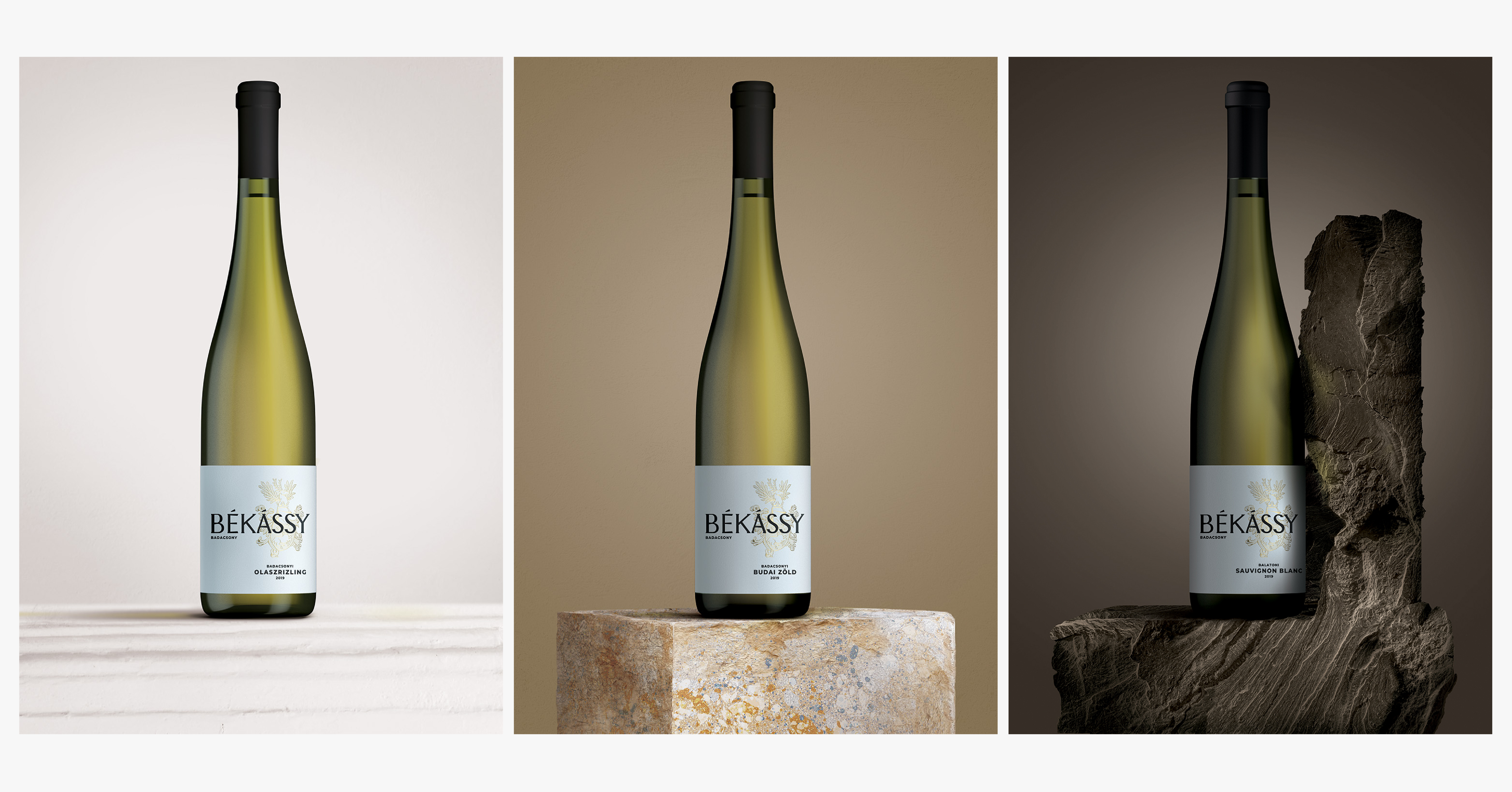
The spirit of art in the Békássy family comes from a long line of patronage. I incorporated it into the brand by linking the art with the core of the Békássy brand. Each season, each wine gets its own representative artwork from various artists around the globe — reinterpreting patronage for our modern times, but still keeping the same spirit alive.
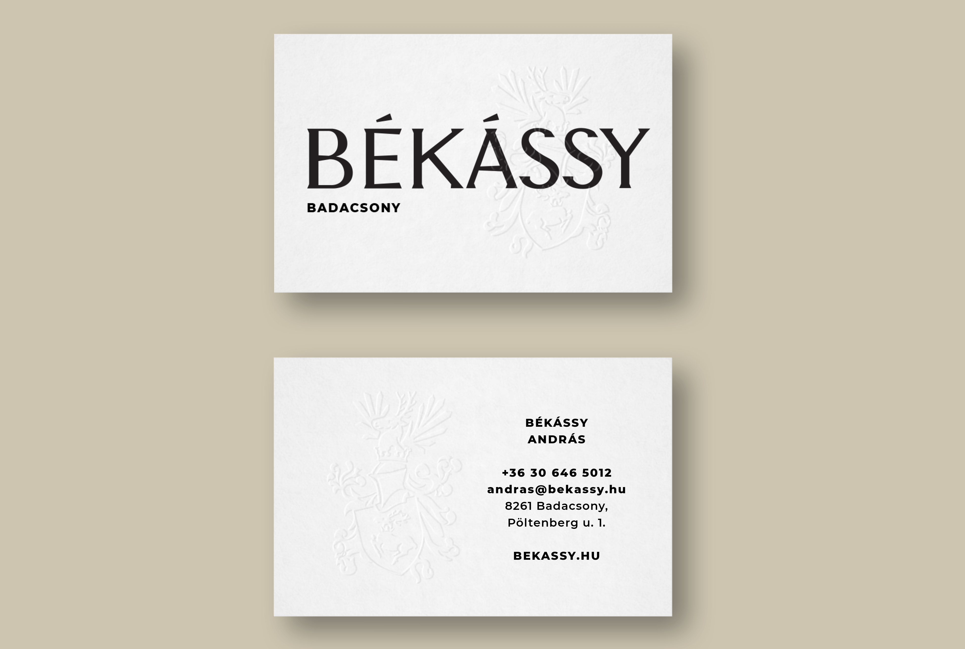
The elements of the label are also a vital part of the CI and are applied in all possible branding touchpoints online and offline.
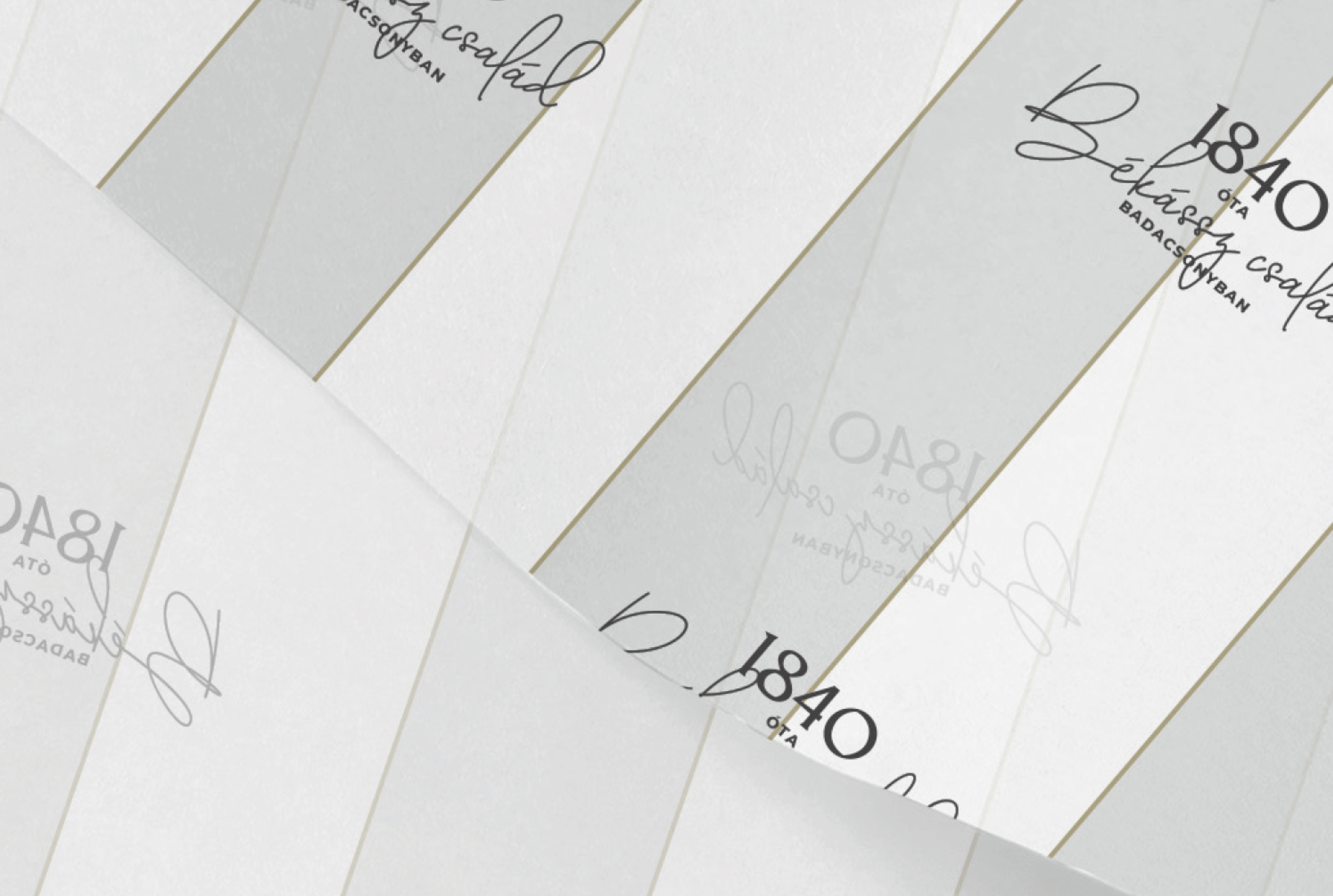
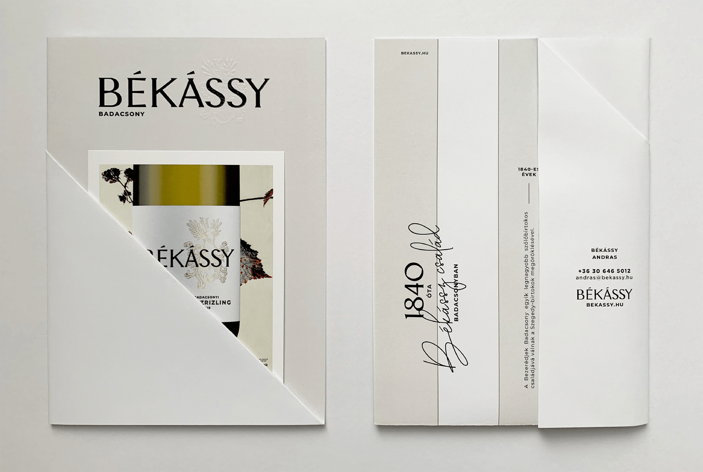
I also created a sales folder: a single sheet of paper tells the story of the winery and through a special folding technique serves as a pouch for a set of postcards that detail the current vintage.
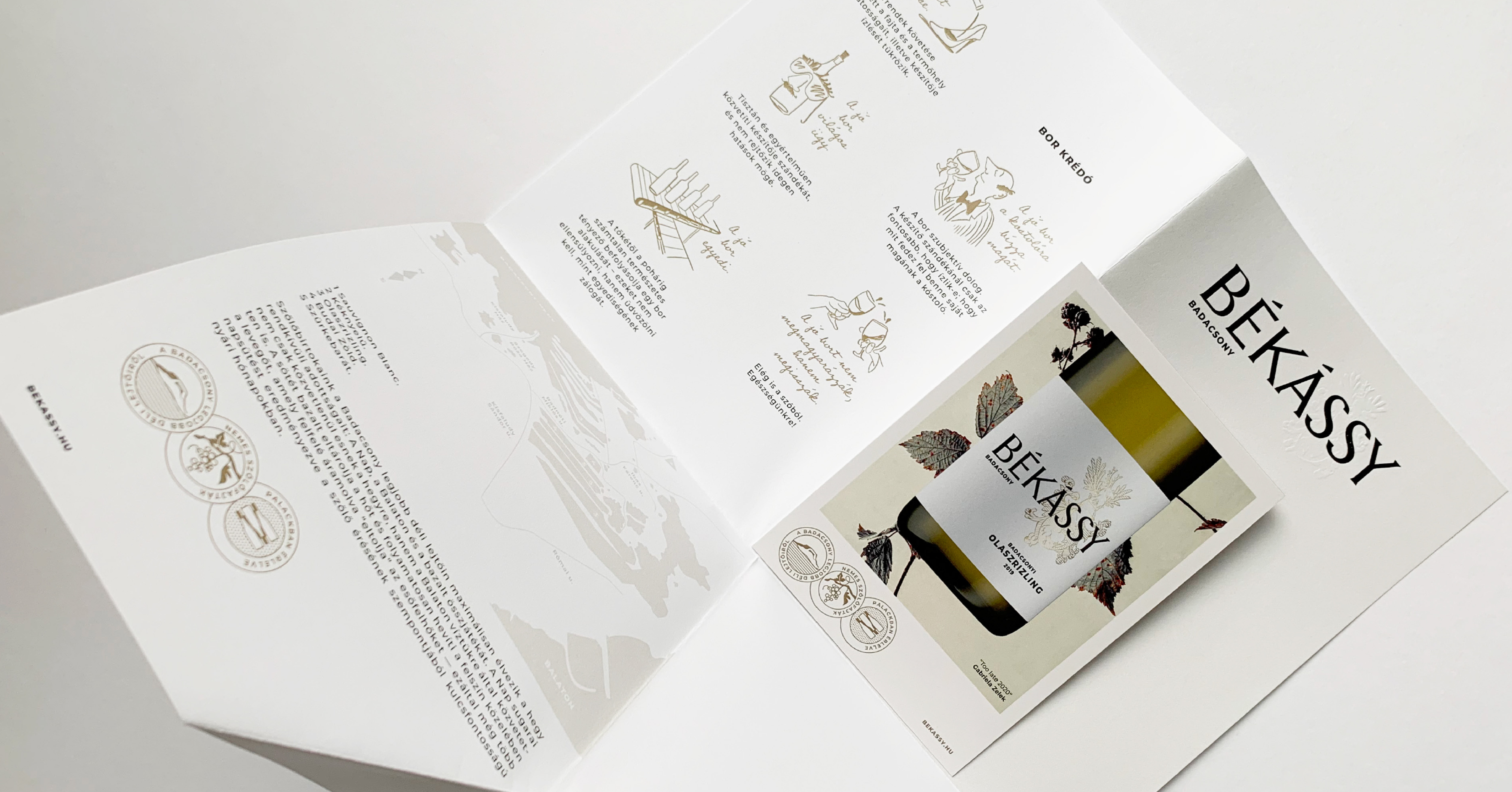
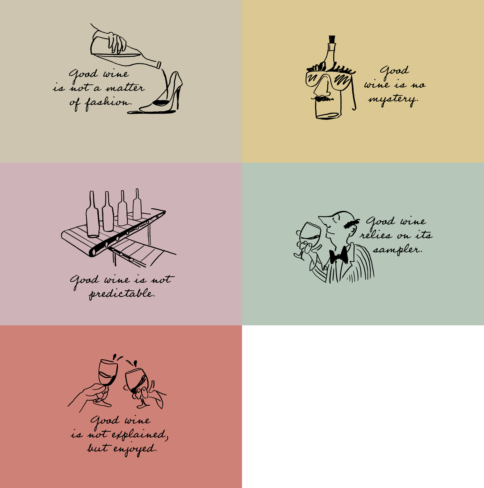
The philosophy of Békássy wine-making was distilled into very clear beliefs, which I decided to highlight by creating easy-going and quirky illustrations.
