Etha Moss
The meditative state of flow.
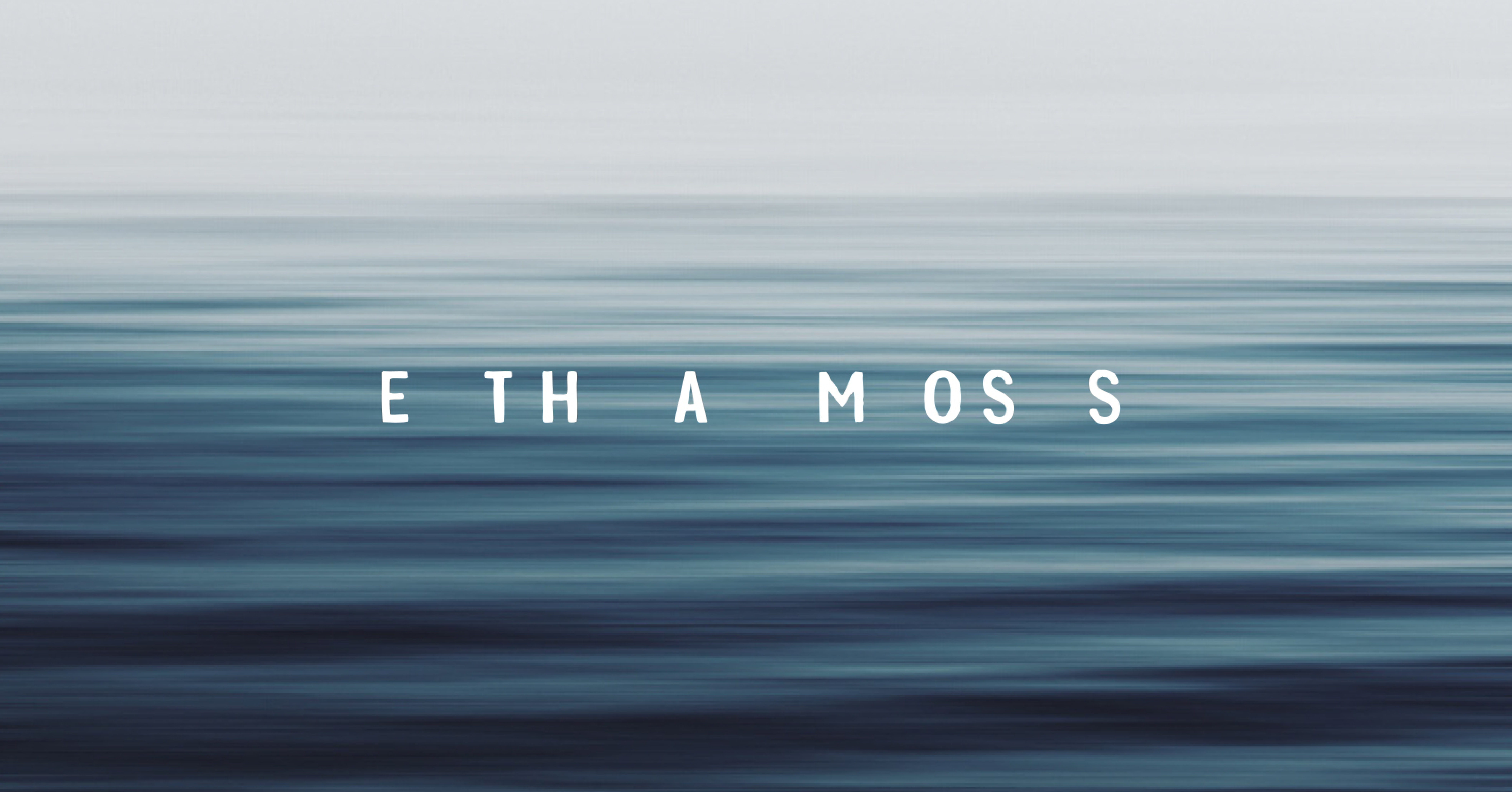
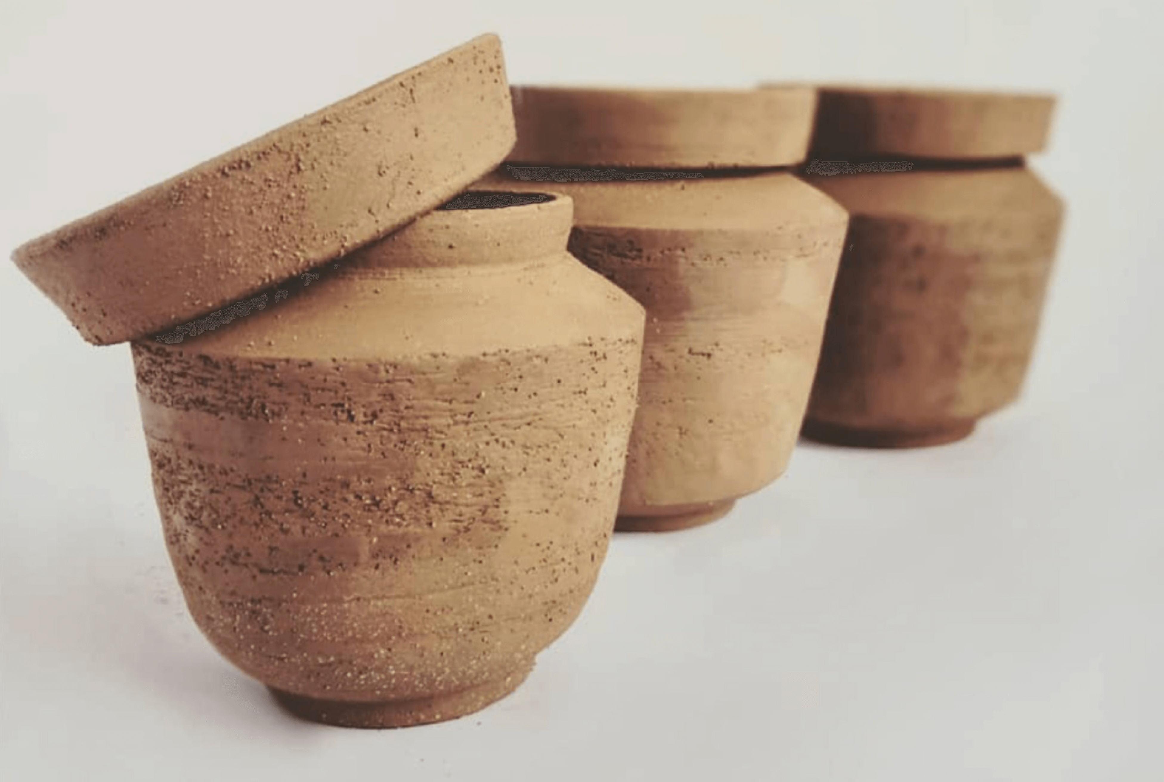
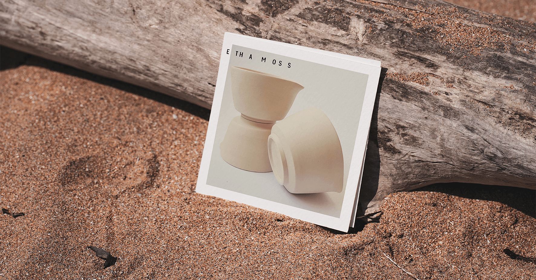
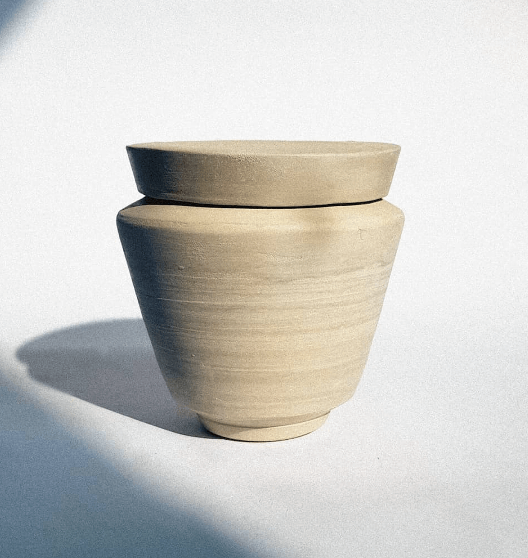
Etha Moss is a pottery brand just starting out. Coming from the shores of the Baltic Sea, its clear appreciation of calmness and flow had to be resembled in the brand as well.
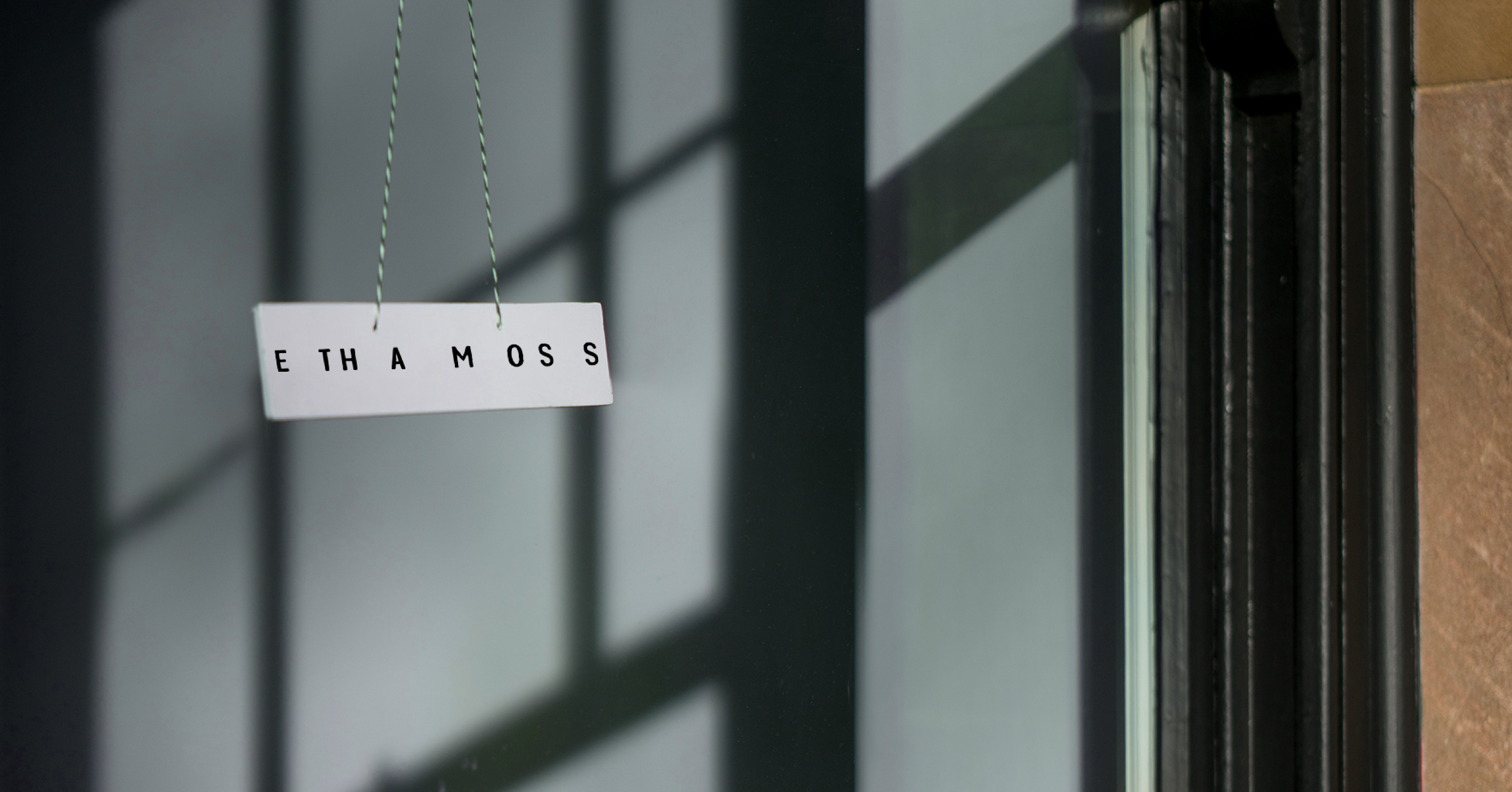
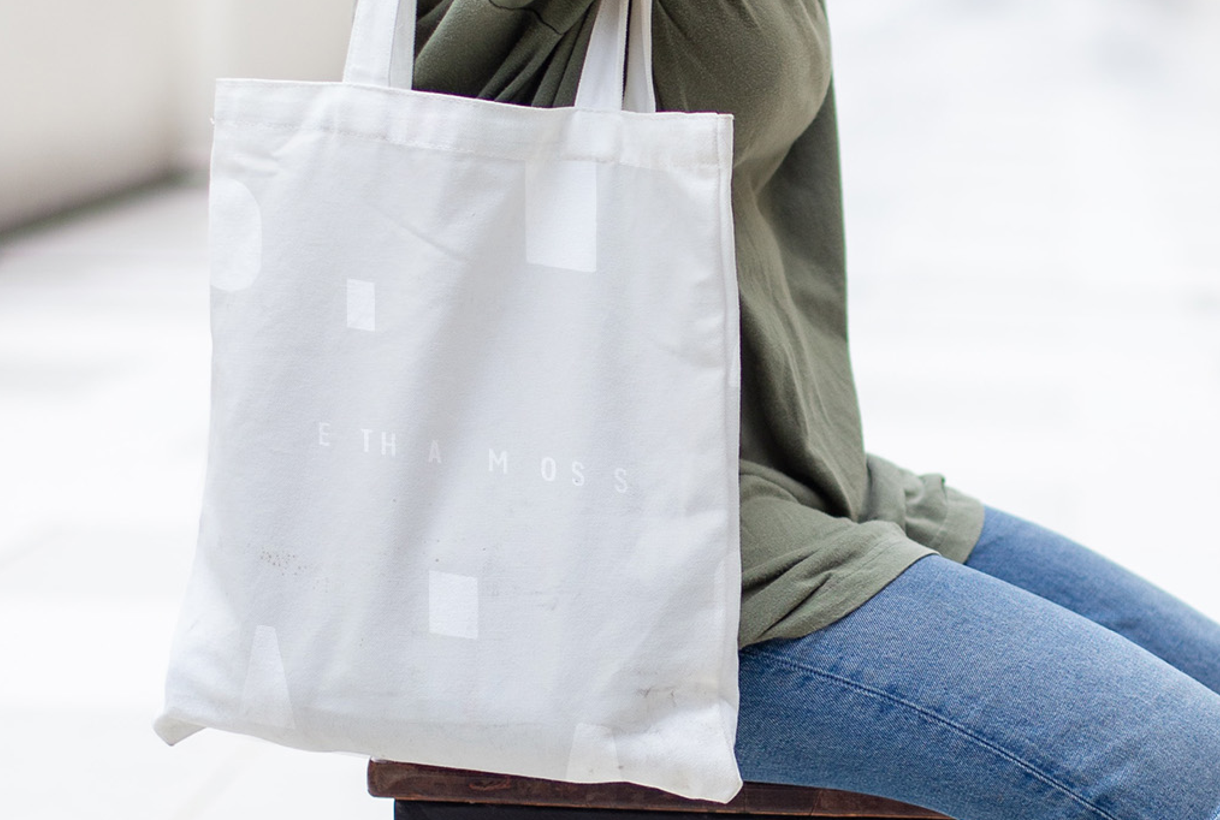
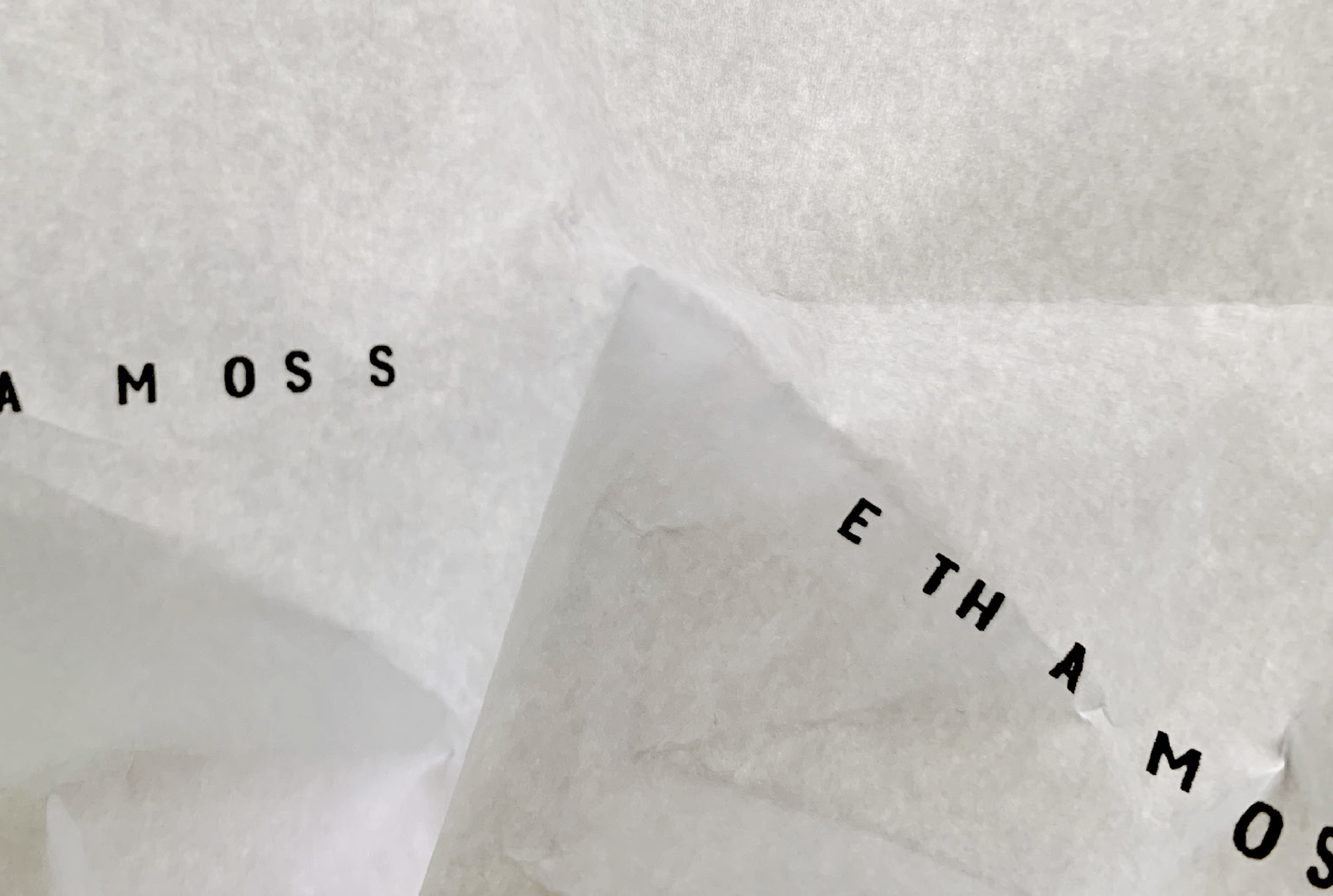
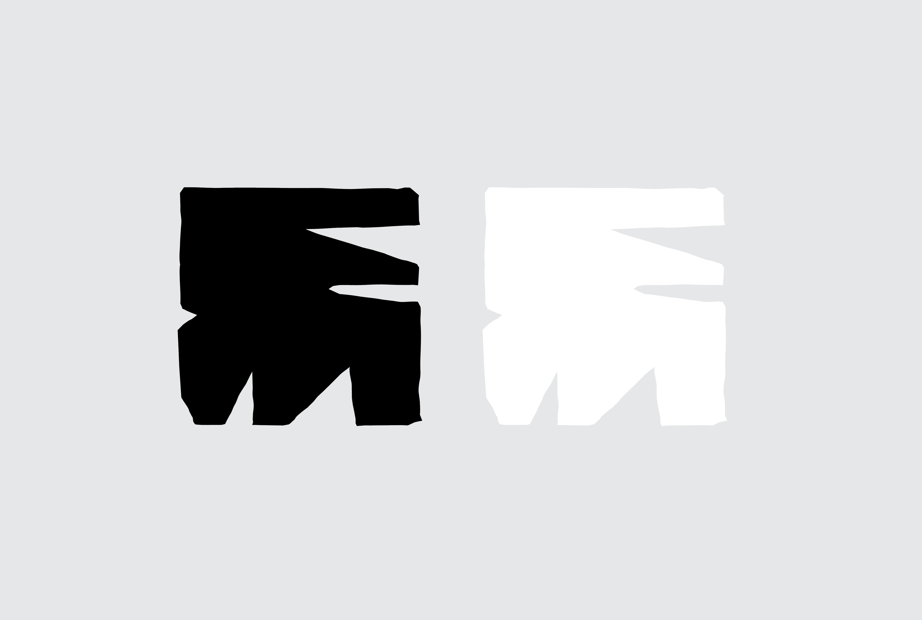
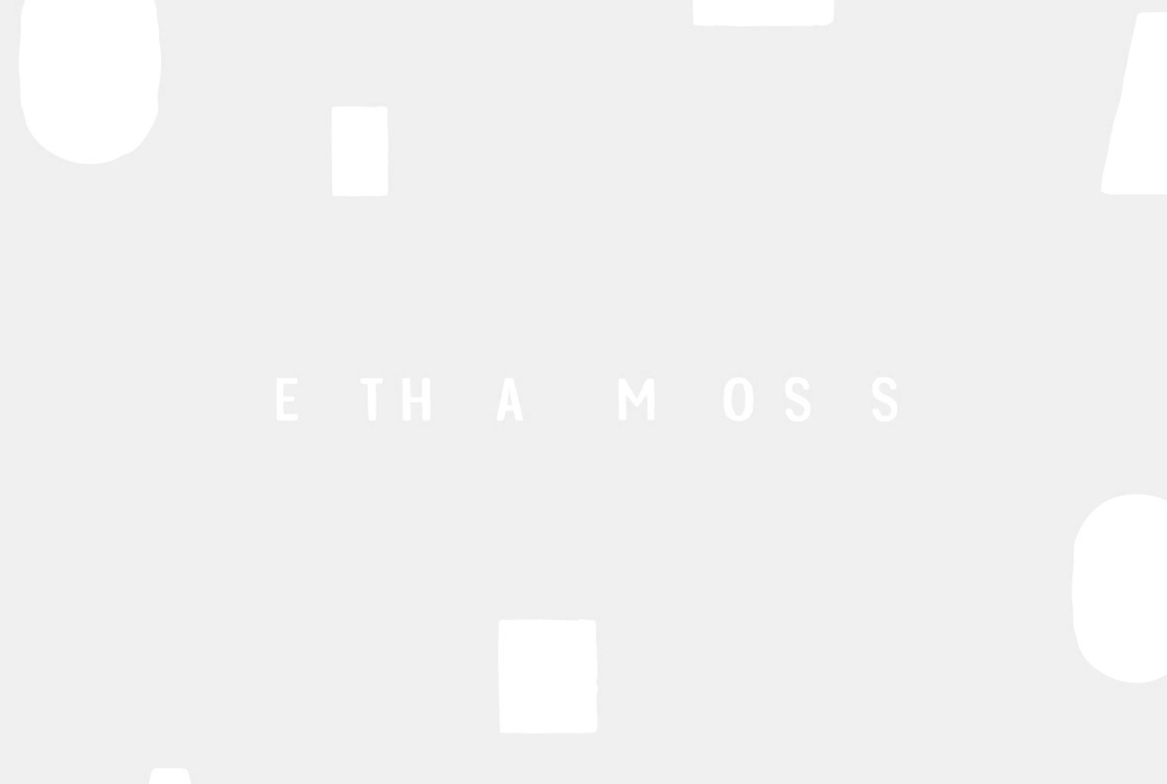
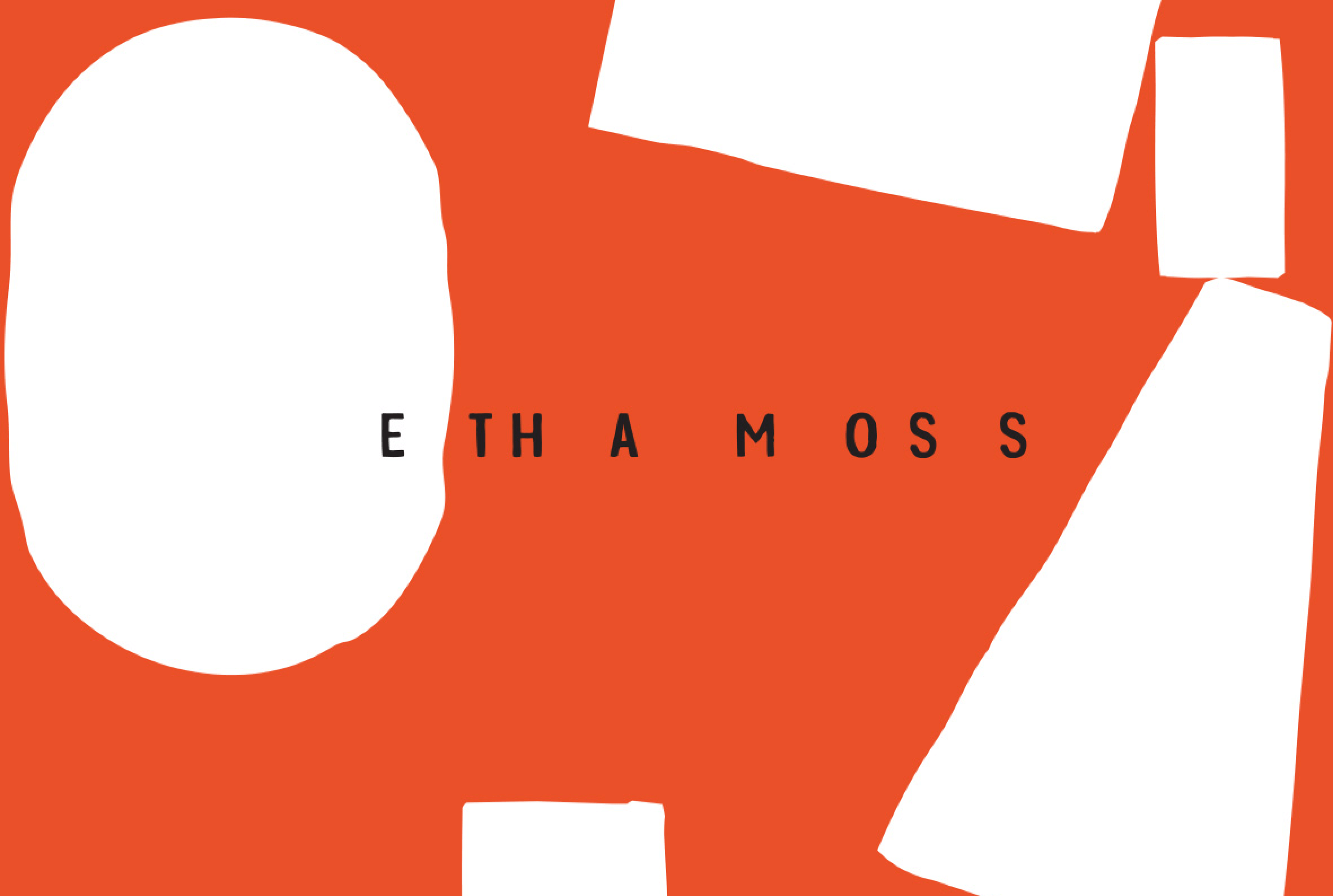
The logo is based on the custom made typography. Simple, but with subtle imperfections as it was molded out of clay.
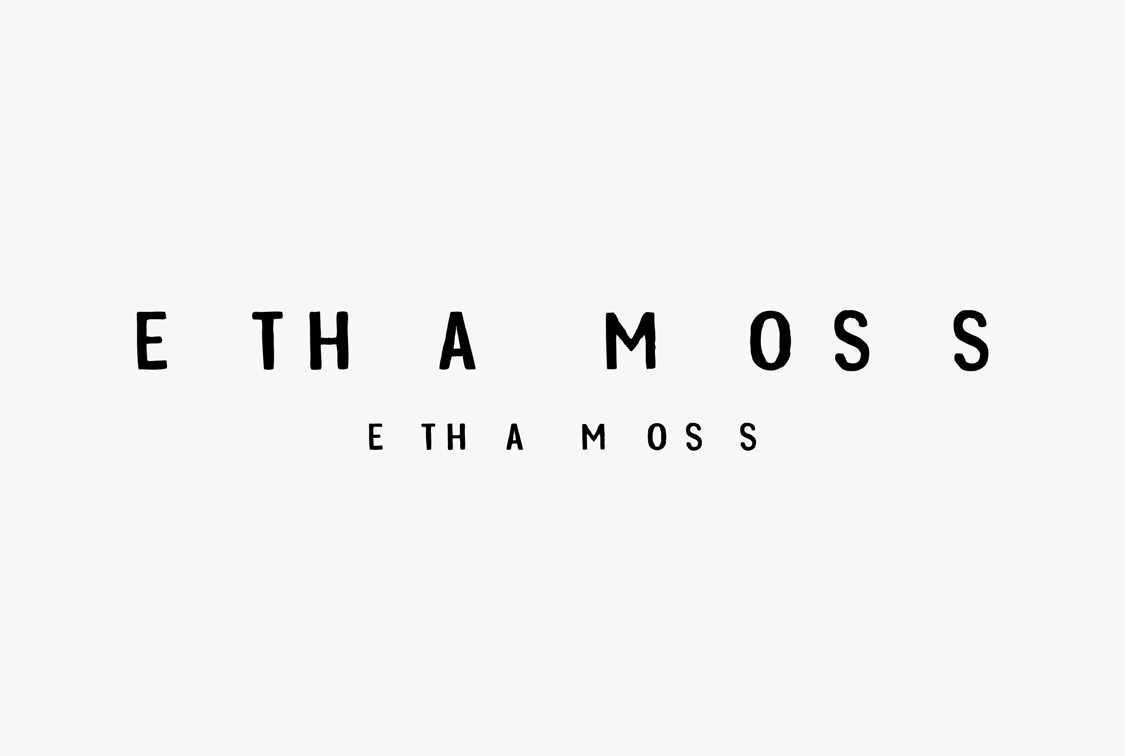
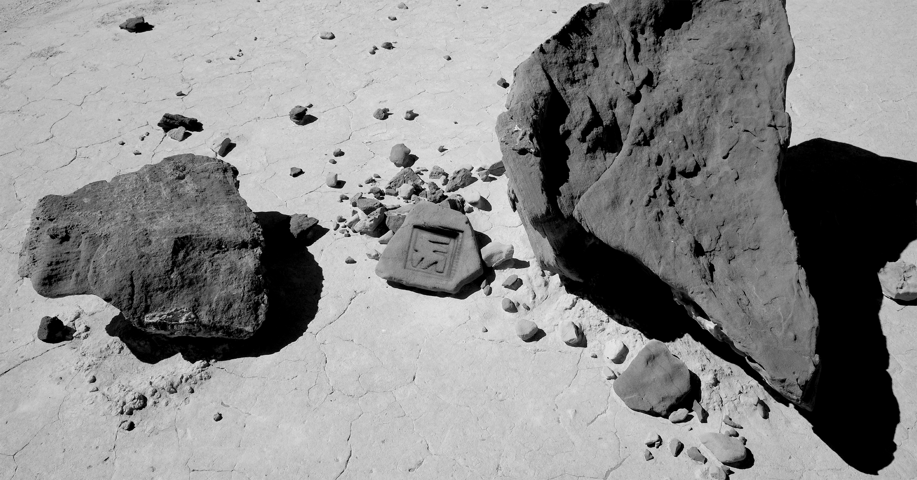
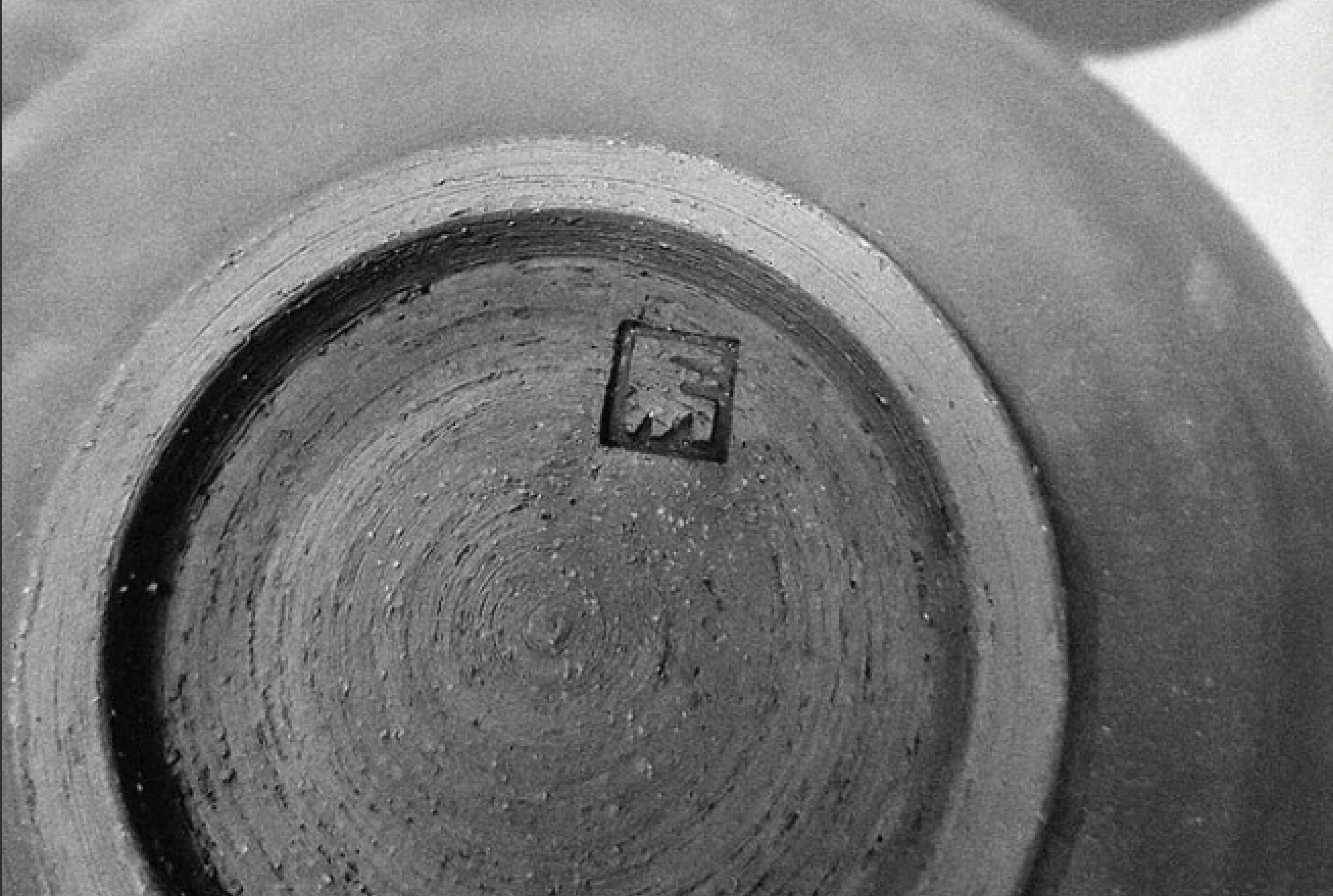
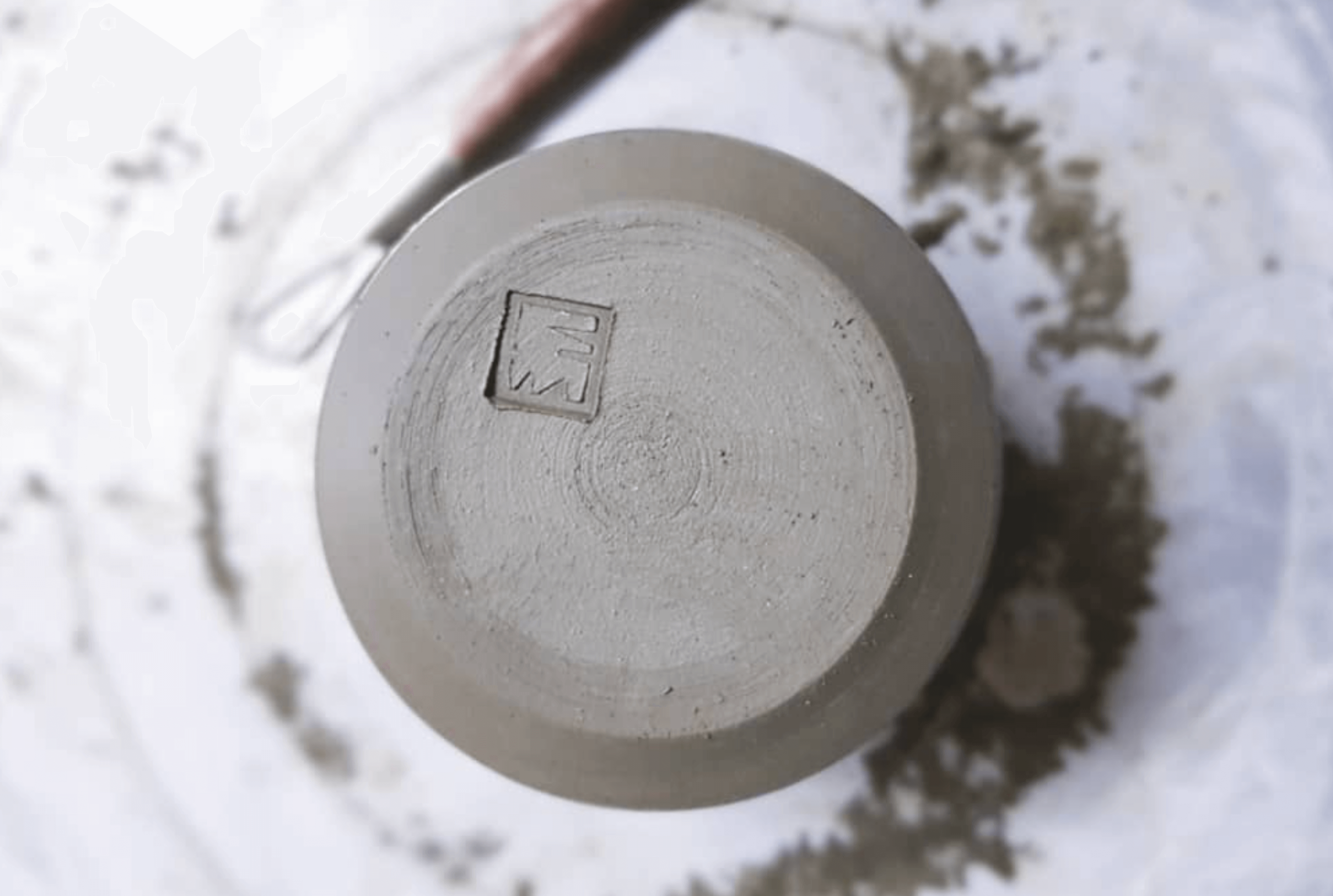
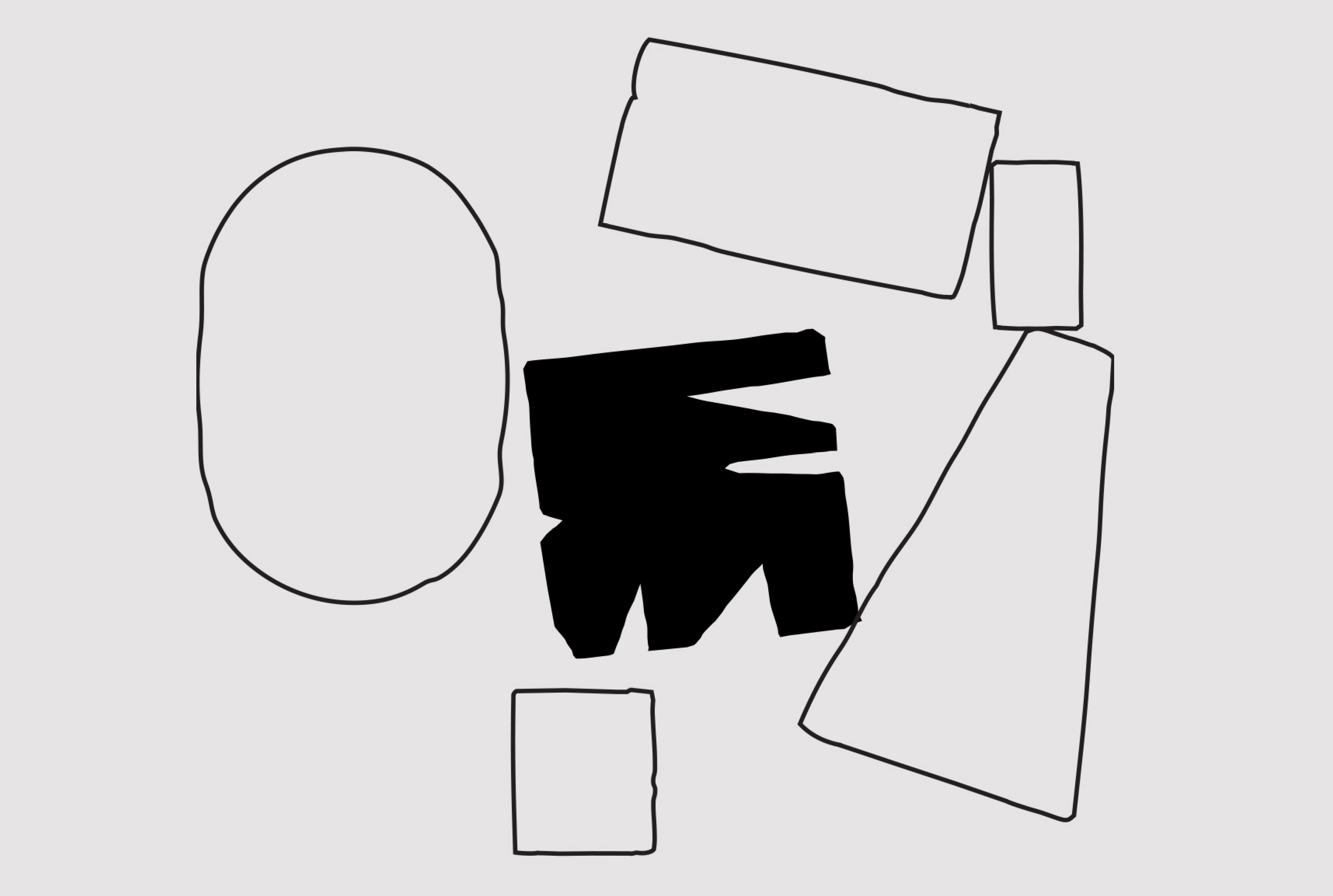
The icon design is based on the Etha Moss initials combined in a strong bold block. It is stamped on the product.
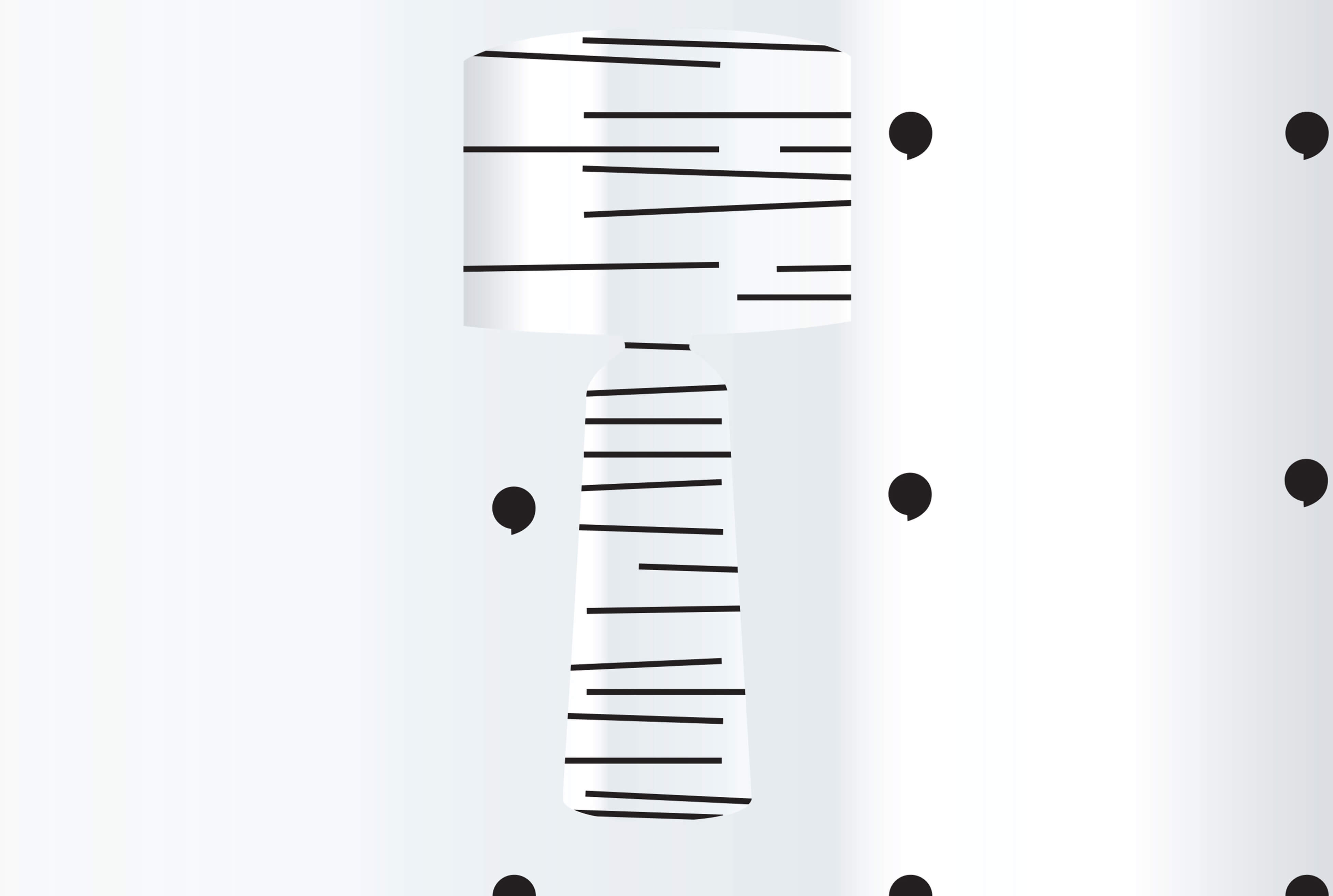
The primary blocks that logo design is based on are used for the pattern and give the brand, just like the product, a handmade feeling.
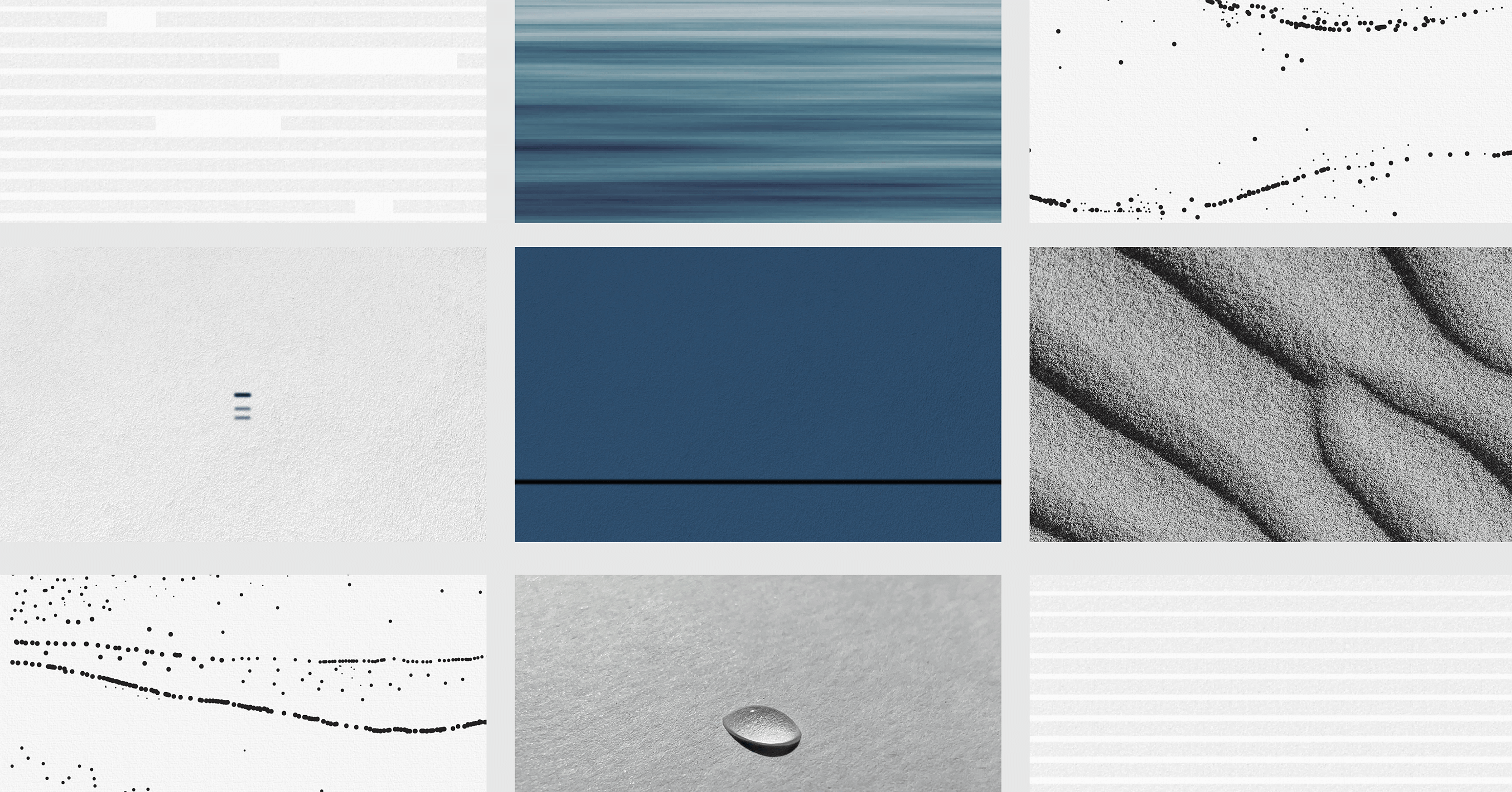
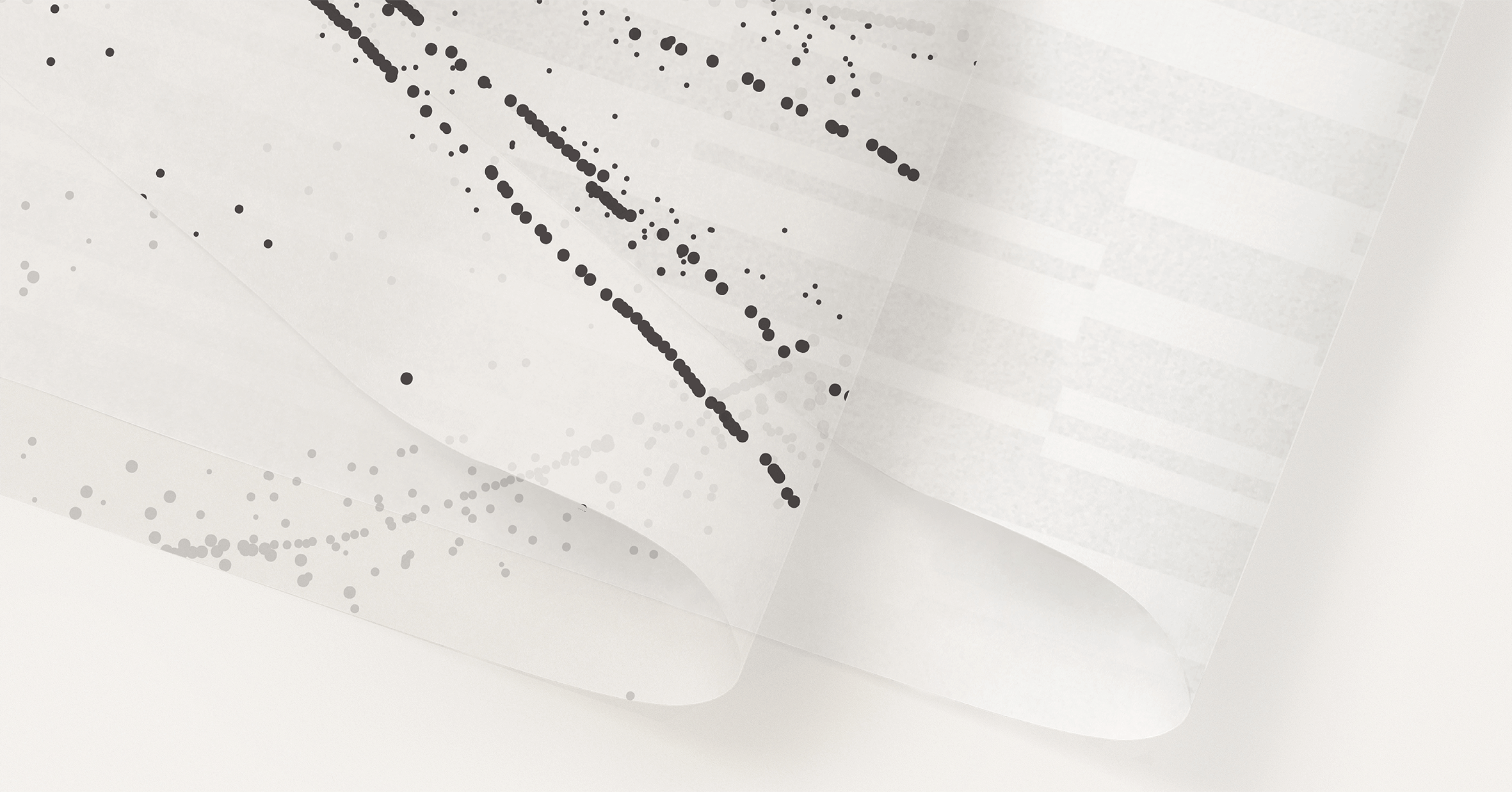
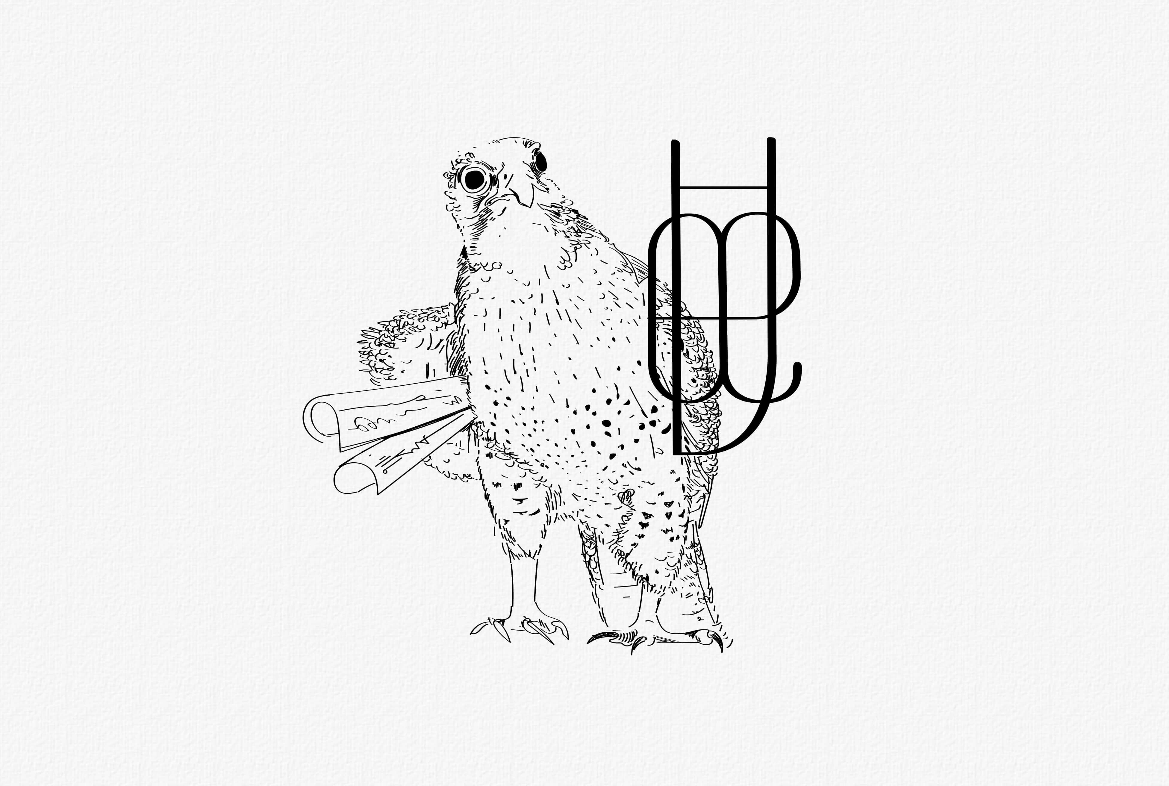
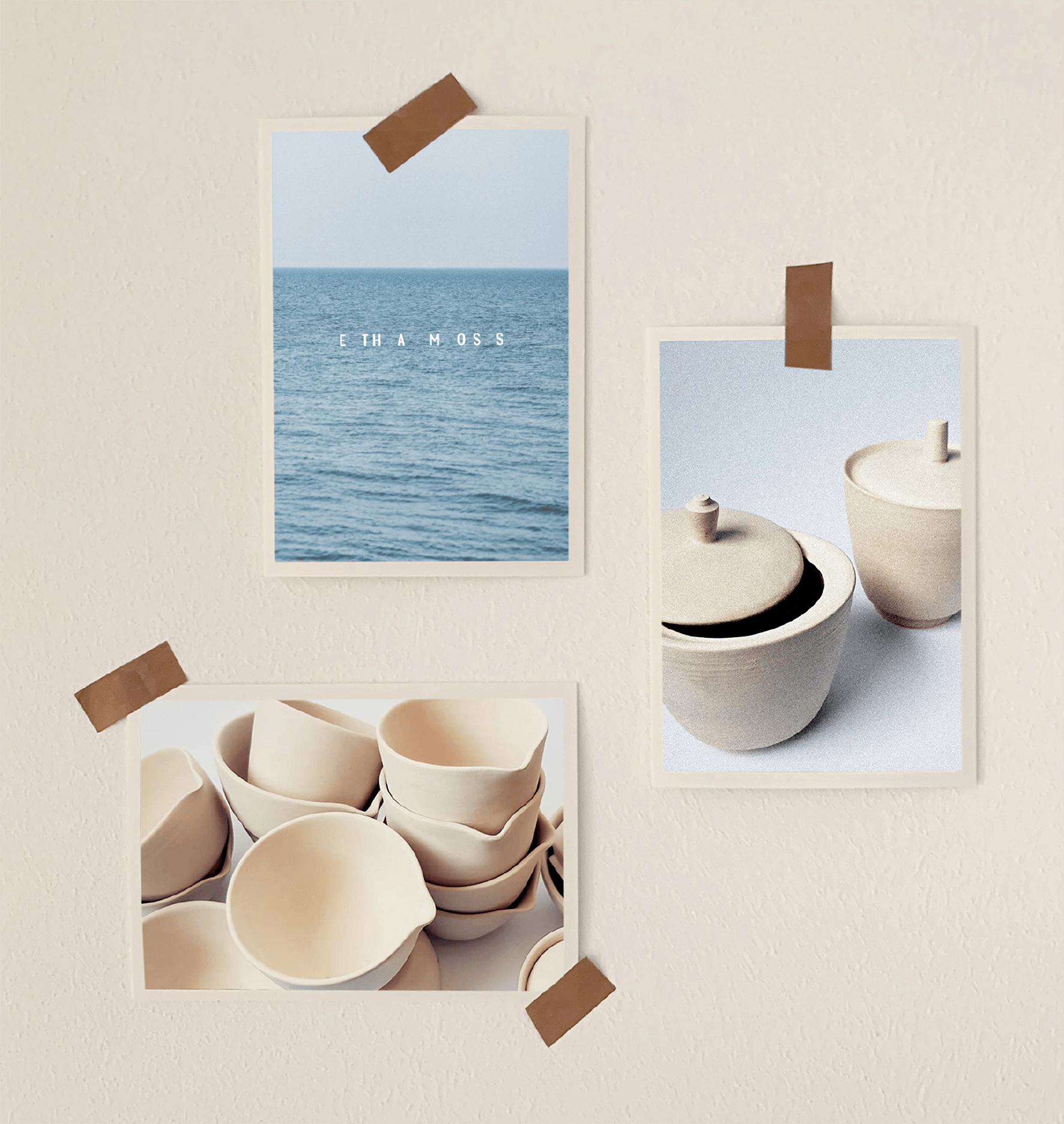
The image world is very calm, but with a tension - expecting something to happen. The sea, the waves, calm lines, broken pieces - static vs dynamic. The flow and its meditative state.